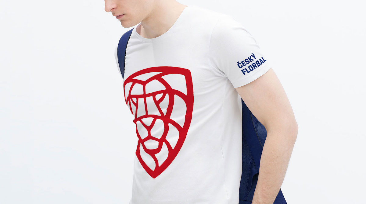
Last year the Czechs installed their new Corporate Identity. New name, new colors, new shapes, new everything. One year later we know, this is the best design thing that ever happened to a floorball federation. And everyone can learn from it.
___STEADY_PAYWALL___
Since 1997 when the Cfbu (meaning „Ceska florbalova federace“) presented it’s previous logo a lot of things happened. Digitalization, higher standards in design and marketing and a more holistic approach towards the communication of a brand. Until last summer the Czechs were trapped in the 90’s.

„So far, floorball didn’t have a clear face. There was just this logo“, explains Filip Suman, president of the Czech floorball federation, in the presentation note to the new design. „Our goal was to create a Corporate Identity that would be recognizable, visible and uniting.“
Together with the prestigious Czech marketing agency Dynamo Design they created a new brand and embedded it into a rich visual cosmos. „Cesky Florbal“ (meaning „Czech Floorball“) was already a common term in the digital channels of the federations, such as Facebook or Twitter. But now it became the official, omnipresent label. The cryptic term of „Ceska Florbalova Unie“ (meaning „Czech floorball federation“) remained for purely formal purposes.
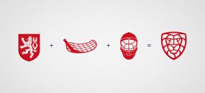
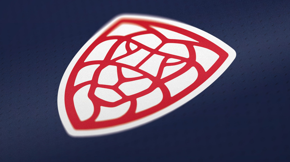
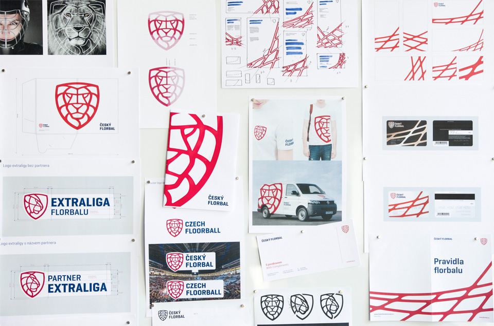
The new logo combined the face of a lion (Czech Republic’s national animal) with the structures of a floorball blade and a goalie mask. Furthermore the motive was formed into the shape of the Czech national crest. To some the link to floorball was not strong enough. They questioned if the broader public would be able to connect it with floorball. Others argued that common symbols such as holey balls or crossed sticks are being overused and therefore lacking originality. This masked lion would be something unique.
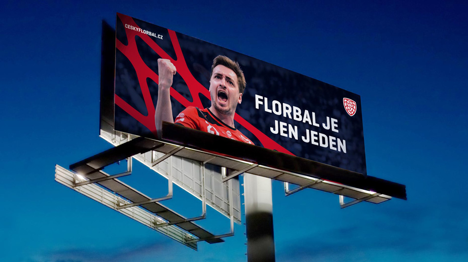
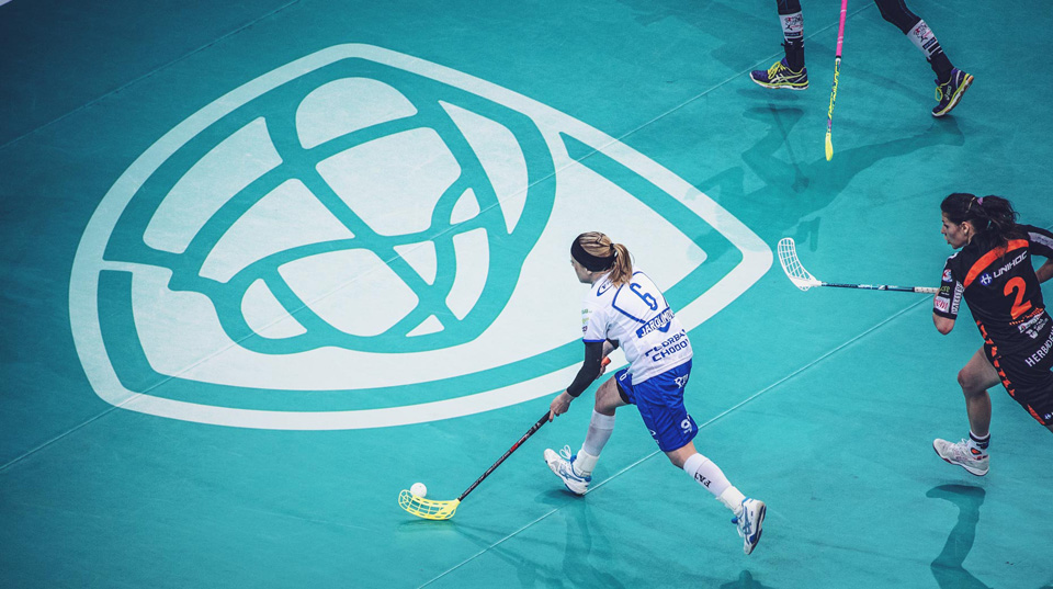
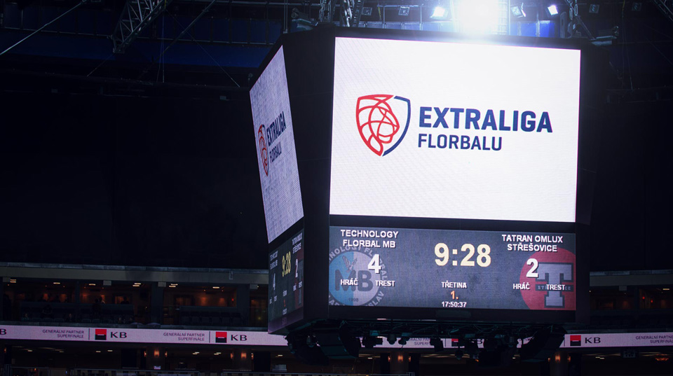
The new design got implemented into all communication channels. It was provided with a kit for various competition logos, uniting leagues and cups in one visual identity. For example, as a result of that, the Czech Men’s Superliga has a lion in its design, the Women’s a lioness.
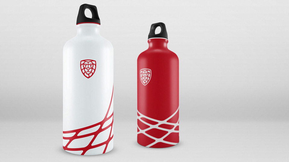
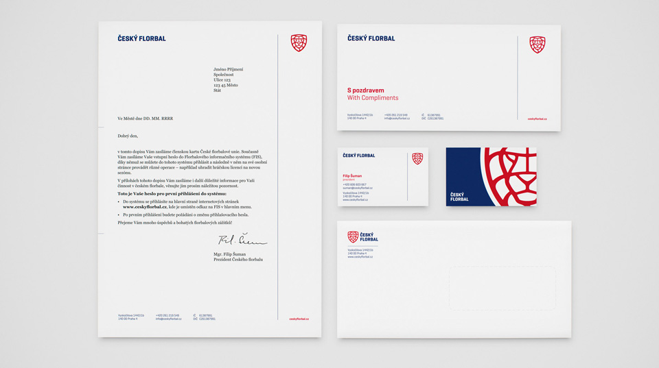
With the necessary style guide colors, fonts and other elements were integrated into editable templates to create professional business material (signatures, rule books, letters, merchandising products, business cards etc.). The federation also offers a multimedial website (including a promo video) to explain their new visual identity and to provide all necessary graphics to work with it properly.

